UTD boasts about its creative expression on a daily basis—it’s almost more well-known than our nerdy STEM culture and diversity. However, it’s severely lacking on showing any actual creative expression in its outdoor spaces and architecture and is in desperate need of more color.
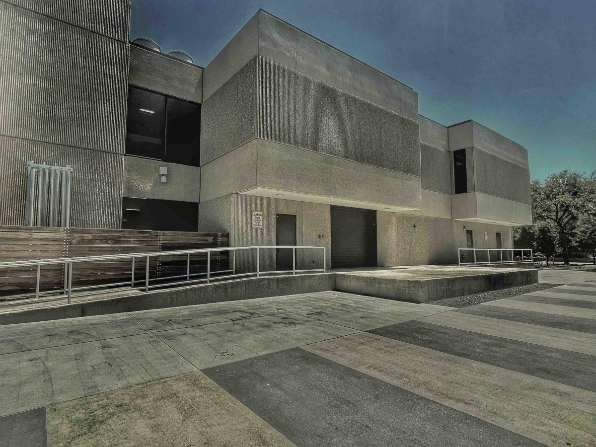
If you look for the ugliest campuses across America, you might find UTD somewhere on that list. Not to mention, in 2019 the Princeton Review placed UTD as #9 in the US for the saddest overall campus, with our ranking moving to #4 more recently in the 2022 edition. One key thing that seems to be missing is that most of our campus color palette is synonymous with gray, beige, and black similar to a parking garage. It can almost be depressing if you look at campus from certain angles. Our campus needs more external color if it wants to stand out and improve.
Imagine how expressive and engaging campus would be if there were more locations like the Graffiti Rock or the Pub mural across campus, where students could decorate with approved designs in places that need more color- or if faculty established official murals in passing locations to spark engagement and admiration.
A strong counter argument is that UTD is stunningly lush in greenery, so much so that its natural beauty is enough color for campus. This is merely an illusion only true on the west side of campus, as ramped nude buildings cannot be shielded by anything green east of the Student Union.
The Pedestrian Promenade connected to Ruthford Avenue is one example of a location that is otherwise boring when compared to west campus. Despite being built to be a main walkway of UTD, beige walls and a loading zone stick out like sore thumbs that neglect any creativity. The promenade could easily be introduced to some school spirit that UTD is desperately lacking. The outer west wall of the Energy Plant could have a mural of Temoc or a Tobor for students to pass everyday. The Berkner Hall loading docks could fit the space theme UTD follows with some spray paint to remake a space station port. The Science building west and north walls could display the fun of science in a visual masterpiece of decor not too dissimilar to Founder North’s science banner.
Think of the Classroom Buildings north of Hoblitzelle Hall, short ugly buildings with pipes and rock landfills for an atmosphere. Any splash of paint could be an improvement to acknowledge these high school budget excuses for classrooms. While most of these classes will eventually move to the ATEC building for the new ATH initiative, the physical structures will still stand as mismatched eyesores, and in its remains we can only hope somebody might mimic the style of maybe North Lab or something to freshen up the campus sight.
Another example that’s just as easy to pick on is the unforgiven space between ECSS and SSA, a walkway that delivers eager visitors directly from the visitor center, to a loading zone reeking of garbage, and then finally to the actual center of campus, which in itself is very disappointing when compared to The Plinth to the east. A lovely first impression defined by dead colorless walls that really does speak: Welcome to UTD. To perhaps make this arrangement more endearing for passing students or visitors: vibrant patterns like a comet shower with Temoc flying high and waving down from a rocket can really help give a warmer welcome instead of the cold shoulder the alleyway otherwise presents. It could at the very least, have students look up to distract them from what is my favorite example of poor visionary planning on campus.
The Blank Space Project might be a solution that could help redefine campus and take up this challenge that faculty has otherwise been reluctant to address; however. their focus for internal design might prove too demanding. It seems like otherwise, there isn’t a large movement to address the consistent eye sources across campus.
If UTD is serious about making campus stand out with its creative arts and its promotion of student expression, then it’s time UTD caught up with its greenery and interior design to let students know that it isn’t just black, gray, beige, and occasional orange that defines campus. As we see more gradual movements across departments promoting art, this could be the next natural step, and it would only ever impress a student in need of spirit.

