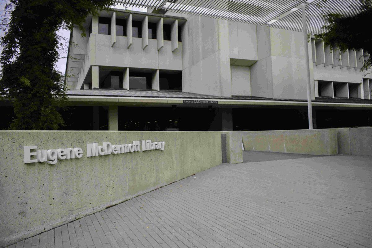
UTD’s McDermott Library is one of the most popular places to study on campus. For incoming college freshmen, it is one of the highlights of the campus tour. Its four floors hold hundreds of students every week and serve not only as a place to study and do homework but as a space for students to come together. Yet, for all the value that the student body seems to place on the library, there is no other word to describe it than “ugly.” Built in the 1970s, it is a classic example of Brutalist architecture with its thick concrete walls and box-like shape.
Walking into the library is akin to walking into a sort of dungeon, primarily due to bad lighting. While it would be ideal to add more windows to the building, it is unreasonable to suggest that the University fundamentally change the building’s structure. Instead, small adjustments to the artificial lighting could improve the environment. The high recess lighting that makes up much of the basement and second floor is neither bright nor close enough to fill the space created by the high ceilings. Simply changing the lighting type to make it closer to where people are working would improve the lighting conditions without having to rewire the whole building. Additionally, warmer lighting could upgrade the current interrogation-like atmosphere.
There is also a distinct mustiness that exudes from the stained carpet, and the concrete pillars that line every area of the library are distressingly sullen. Despite the efforts of the janitorial staff, the carpets simply require replacement, so it may be best to just resolve the stains with new carpeting. Implementing a new coat of paint in a brighter color could allow for a fresher – and friendlier – environment and have a significant impact on the library’s ambiance. Similarly, the checkerboard flooring in the basement and the dull brown tile could be replaced with something more modern and reflective of the little light that is available, both lightening the space and making it feel less dated.
The library should also further showcase the student body. Walls and other free spaces could be used to display talents and interests of students through art or other forms of media, personalizing the library to the population that uses it the most.
UTD students spend hours upon hours in the library, and there is no doubt that it provides a quiet space to be productive. However, it is not unreasonable to expect more from one of the central buildings on campus – the place in which countless people gather. Implementing a few simple design changes could drastically improve the space for students without losing that 1970s Texas Instruments charm.


