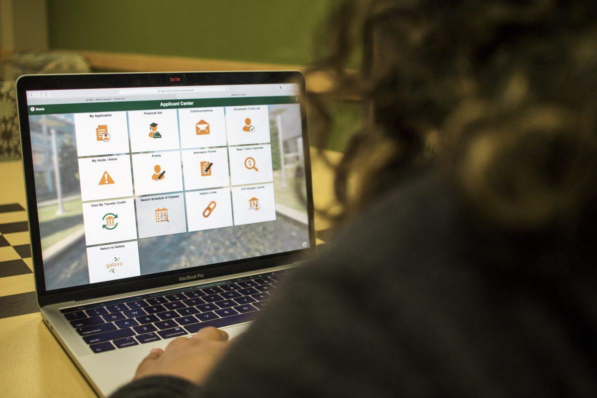
On Oct. 28, the Office of Information Technology made sweeping changes to the Orion Student Center.
The new layout is now mobile-friendly compared to the previous design where accessing the website from a mobile device was not as intuitive, the changes make it easier to navigate and have higher user optimization.
“Well, it started with some feedback we’ve gotten from users either in our administrative offices and from students over the years,” Director of PeopleSoft and Analytics for OIT Ryan Meyers said.
Meyers and other OIT workers have to work with the Orion system, which is sponsored by Oracle and based on the PeopleSoft system.
“Their technology is moving towards more of a usability focus from an old functionality focus,” Meyers said. “So this was an opportunity for us to leverage some of that new look and feel this new user experience options that they gave us.”
Previously, the student center simply had links to get to certain places, but now, OIT has changed it so students are able to see ten panels of categories that they can choose from.
“In coordination with the registrar’s office, enrollment management and some of the other functional areas as well as some of our student workers, we identified some opportunities to make it a little more efficient and more effective and make it more mobile friendly,” Meyers said.
In terms of future advances in other areas, Business Technical Analyst for the Orion team, Allison Lewis, said there is potential. Lewis said they started with the student center as students make up the largest user group.
“This is kind of a first step to being able to make the system a little more student-friendly, user-friendly,” Technical Leader for PeopleSoft and Orion Scott Harman said. “So I think you’ll see continued rollouts of either incremental changes to the student center that’s out there, enhancements, expansions of it. We also have in our other functional areas faculty focus advisor pieces, other items and other areas that we think will enhance their ability to serve our students better.”
This change was not an easy one, Harman said.
“I think the biggest thing to understand is (that) there are thousands of things that go into this,” he said. “This is not a standalone piece of software that does one thing. There’s a lot of changes (in) the way the processing goes on in the background, like number of servers, things like that.”
In terms of feedback, Meyers said students and other users have given positive reviews to the changes.
“We’ve had a lot of students say ‘It’s easier to use, I can find things faster,’” Meyers said. “We’ve had a couple of students report some bugs. It’s allowed us to adjust some things fairly quickly based on that feedback. But for the most part, they like the fact that it’s mobile-friendly all the way through where it wasn’t before.”
Harman sees this change as a learning curve as the OIT workers also learn how to change the program. Students can visit the OIT website for more information.
“It’s an opportunity for us to continue to expand. If you’re in IT, one of the things that you have to do is enjoy learning new things because the technology always changes,” Harman said. “While on the front end, the goal is to make it look simple and you know, very streamlined.”


